Amazon Prime Video undergoes the biggest redesign in its history
Prime Video changes the design of its interface after years with an "overwhelming" and unintuitive one. These are all the changes that come with the new design.
A critical point of streaming series and movie platforms, such as Netflix, HBO Max, or Disney+, is that their interface is designed correctly, with accessible menus and options, elements that allow you to see the relevant content information, and a clean and intuitive general design. Unfortunately, this is not something the Amazon Prime Video app complies with. At least until now. The service of the company founded by Jeff Bezos is receiving, for the first time in years, a new design that is much more minimalist and, according to the firm itself, “less busy and overwhelming for our clients.”
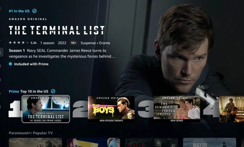
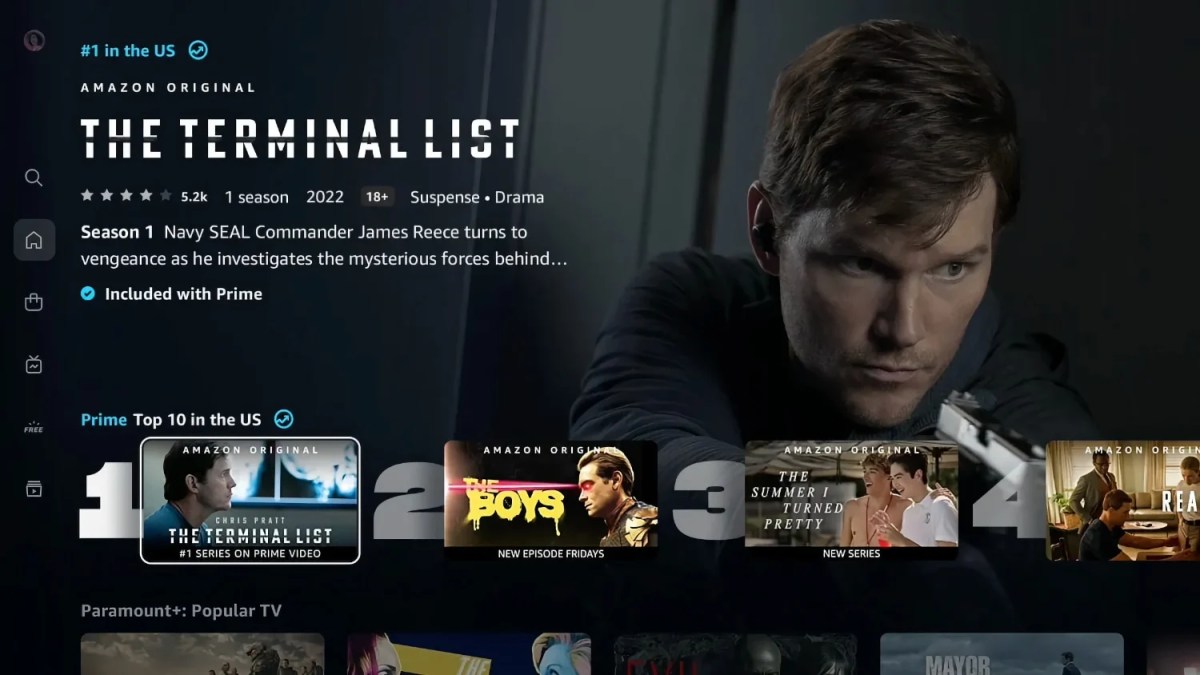
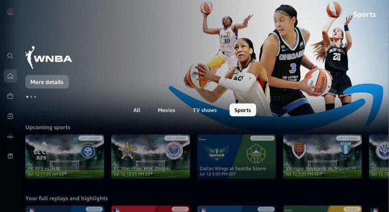
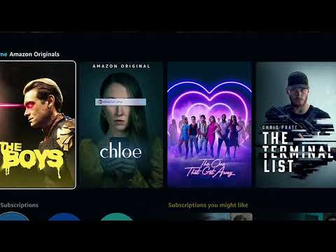
The new interface of Amazon Prime Video has been modified from top to bottom. Now, the menus that allow access to the different sections, such as the store, the free content tab, or the account settings, are located on the left side of the screen. At the same time, in the previous interface, they were positioned in the upper area. On the other hand, how the application displays the content on the cover has been modified. The first line shows the ten most popular ranges with the new look.
The new design of Amazon Prime Video also makes it much easier to know if the series, movie, or documentary is available through the user’s subscription or, instead, if it is necessary to rent it. This is already something that the old app included since Amazon, let’s remember, does not offer all the content of its platform for free for users with a Prime subscription. However, a more visible badge will be displayed each time the user browses a title.
Prime Video’s new interface is very reminiscent of other streaming services.
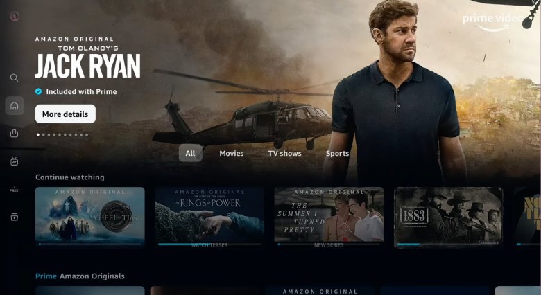
Amazon has also modified the preview displayed each time a user scrolls through the content, now showing an image of the preselected series or movie and expanding it to a trailer-like preview when the user does not scroll to the next one—The carousel title.
All these new elements, except the badge that indicates whether a series or movie is included with the Amazon Prime subscription, are very similar to what we see on other streaming platforms. Netflix and HBO Max, for example, also have a list with the ten most popular titles, as well as a side menu where you can access different categories. The preview in the carousel is practically identical to what Apple TV + offers, while the icons and shapes are very similar to what we see on Disney +.
The new redesign, obtained after 18 months of work, as confirmed by The Verge, will first arrive in the Prime Video app on Android and TV devices, such as Fire TV, Roku, Apple TV, or Android TV. Later, the interface will be available in the web and iOS versions. We excluded the PlayStation 3 and the third-generation Apple TV (announced in 2012). In the latter case, Amazon will maintain the original interface.